Find yourself struggling to pick colours for your space marines or other warhammer miniature projects?
Trying to figure out colour schemes can sometimes be the very thing causes you to put down the brush, killing all that momentum and motivation!
So here's three super quick tips to fight back!
TIP #1 - START FROM THE GROUND UP
We try and start every project with one or two keywords in mind to help frame the idea and keep us focused.
- Where? Is it hot, dry, cold, magical, exotic, jungle, forest, urban, ancient?
- Feeling? Aggressive, sinister, tranquil, colourful, majestic, rugged, broken?
Committing to keywords early helps you check your work against the idea to make sure it's hitting.
It even works to help determine which basing bits might enhance your miniatures! (more to come on that!)
For our Sons of Medusa project, we didn't follow this strategy and it took longer and we ended up having to redo a bunch of work. All we knew is we wanted them in a forest and we needed contrast between the models and bases. 🤦♂️
TIP #2 - REFERENCES AND MOOD BOARDS
Image collages are a great way to reinforce a colour mood, the subjects in the photo don't matter, just the colours.
We use a desktop program called PureRef - Get it here which allows you to copy and paste images in while retaining their original size. You can expand out to huge boards and zoom in easily, so if you work at a desktop/laptop its a great tool.

- References are usually images that you select for specific things, like iconography or a texture effect. It's an image that provides information.
- Mood is created from images that convey a consistent feeling, usually sharing the same or similar colours whether the subject can be irrelevant.
Then we searched for forest illustrations and came across a number that had a yellowish or green-blue vibe. At the time we couldn't decide so we added both.

The challenge with doing a green forest and green marines is they can easily blend together, so we needed a way to differentiate them.
We rushed this project and totally failed to keyword, missing our mark.

The green armour isn't as limey as our example but is super intense, which is perfect... but the ground is too green and blends too much into the shadow of the green armour and feels like the whole thing is one colour! Not good!
TIP #3 - ADAPT ADAPT ADAPT!
With new Epic Basing bits came new opportunities to add more types of plants and thus more types of greens! It also helped inspire the change in colours to the bases.
Some simple ways to adapt or adjust your colours:
- Adjust the temperature of a colour by adding yellow/orange (warm) or blueish/violets (cool)
- Decrease saturation of a colour that's standing out too much (add white, black, or grey, or the colour's opposite red-cyan, green-magenta, yellow-blue, orange-teal etc)
- Change the value, use a lighter or darker version of the colour
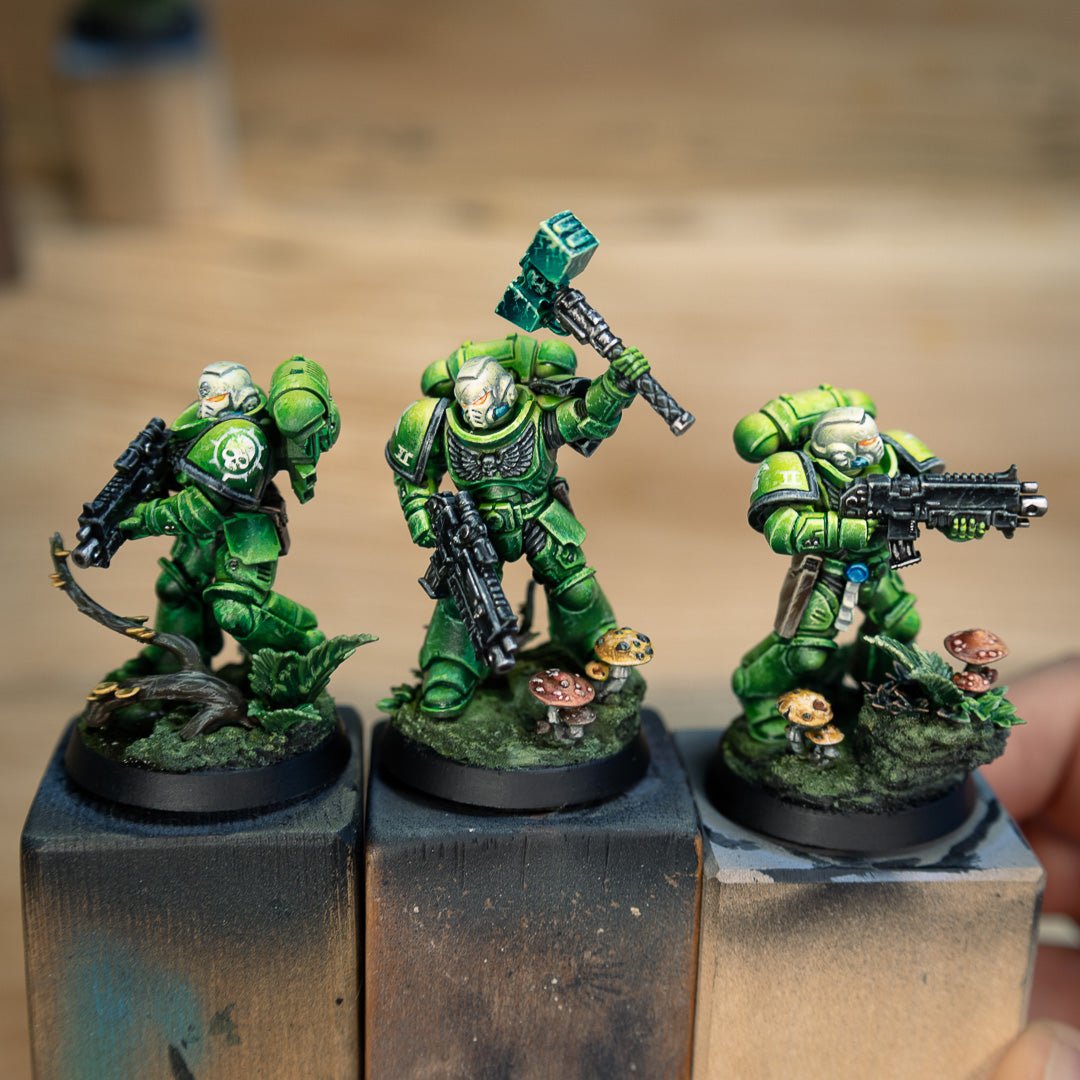
WHAT WE CHANGED
We noticed the yellow shrooms from the first round were a nice touch, but the red stood out too much next to all that green.
- We knocked the red back and then used it to decrease saturation of some of the greens in the plants.
- Then we tried to add a bit more yellow to adjust the temperature of the base and plant lights.
- We changed the value of the different plants, so we have some dark groundcover, light peperomia, and mid green Ivy and Ferns

THE FINAL
We call this new basing scheme "Faded Forest" to capture the worn feeling of it. It's weary after all the battle, but not dead or destroyed!
The surface scratches on the marines helps reflect the "worn/faded" keyword.
We'll follow up with more army shots as we get more done, but hopefully this gives you some insight into how these tips can work to shape your projects.